Well, at one occasion, I had a demo to prospect and they want to see the Chart Capabilities in CRM 2013, especially to show Cases based on the Customer Location (can be City, State, or Country).
The problem is, currently, the charts (out of the box charts) are only supporting to display chart with Axis X or Group By from the same entity fields.

For example,
- Case by Case Origin
- Case by Create On
- Case by Owner
- Case by Priority
- Case by Case Stage
- Case by Case Type
- Case by Contract
- Case by Created By, and
- Case by Customer, and so on
How about if I want to show Case by Customer Location (by City, by State, or by Country) or to show Case by Contract Expired Date.
I though it is impossible without modifying the XML and I don’t want to show that because the audiences are definitely from Business Users and non-developers.
Then, I was thinking that I have to create 3 custom fields in Case entity, which I will auto-populate using Workflow every time create Cases from Customer.
But, what if the Address from Customer is changed, then I have to create another custom business process to Update those 3 fields in the related case record.
Finally, I found a solution which I didn’t expect before and it is so easy.
So, first of all, you need to create a new view or modify the existing view.
And.. Then, add the Column from the related Entity, in this case I want to show Case by Customer Location, then I add columns from Account:
- City
- State
- Country


Then, I save this view.
Without publishing, you can can go back to the Case Charts.
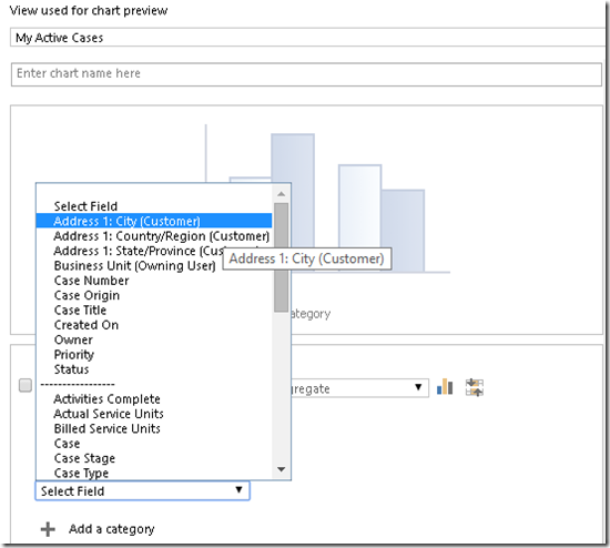
Once you go back to the Case Charts then create a new Chart, you can see those 3 new fields (from Account – a related entity) were added and were available to be selected as the Horizontal Axis (Axis-X)
Yess..Bump..Now you can see...
Those fields are available as Category Axis that you can use..

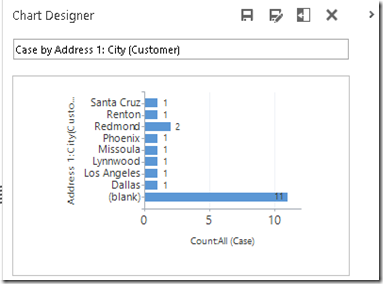
Then, I am be able to show Chart, Case by Customer City, State, or Country.


I don’t know now whether you have known about this trick, but I just found it without any expectation before.
*No coding, no XML modification :)
Hope this helps!
Thank you.

I like it, very ingenious!
ReplyDelete- Jaap Braaksma
Hi Jaap,
DeleteThank you for your positive feedback!
This is a really useful technique, so in the MOC Customisation course, in the labs and demos a custom view is created with a column from a parent entity so that it is then available in the module on charts to use as a category. Hopefully more people doing the course will learn from these sort of "real world" bets practice approaches.
ReplyDelete